Autoblog explains below…
Why all of this year’s F1 noses are so ugly [w/video]
By Jonathon RamseyRSS feed
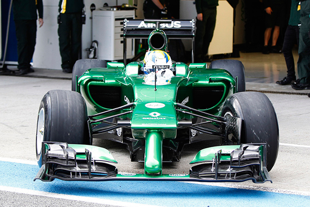
If you’re a serious fan of Formula One, you already know all about The Great Nosecone Conundrum of 2014. Those given to parsing each year’s F1 regulations predicted the strong possibility of the so-called “anteater” noses as far back as early December 2013. Highly suggestive visual evidence first came after Caterham’s crash test in early January, with further proof coming as soon as Williams showed a rendering of the FW36 challenger for this year’s championship. That car earned a name that wasn’t nearly so kind as “anteater.”
Casual followers of the sport – or anyone who gets the feed from this site – probably don’t know what’s happening, except to wonder why the current year’s F1 cars are led by appendages that would make Cyrano de Bergerac feel a whole lot better about himself.
The short answer to the question of ugsome F1 noses is “FIA regulations and safety.” The reason there are various kinds of ugsome noses is simpler: engineers. The same boffins who have given us advances including carbon fiber monocoques, six-wheeled cars, double diffusers and Drag Reduction Systems are bred to do everything in their power to exploit every possible freedom in the regulations to make the cars they’re building go faster – the caveat being that those advances have to work within the overall philosophy of the whole car.
So let’s take a rhinologic look at how we got here. It all started with an incident between Mark Webber and Heikki Kovaleinen at the European Grand Prix in 2010…
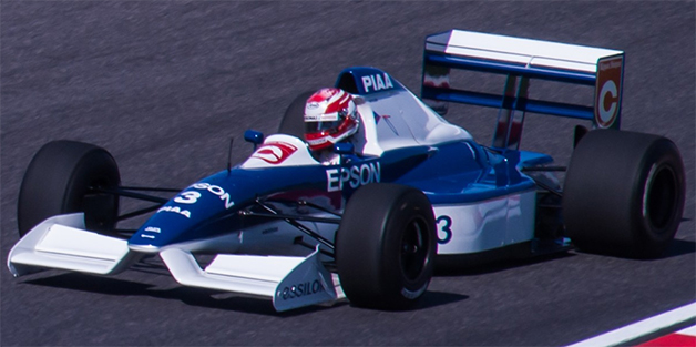
Actually, it starts 20 years before that, with the Tyrell 019 that raced in the 1990 F1 season. Team technical director Harvey Postlethwaite and chief designer Jean-Claude Migeot realized that they could get a lot more air underneath the car if they raised front of the nose up and out of the way. Doing so would increase the airflow under the car, and getting more airflow under the car relative to the airflow going over the top of the car would achieve more aerodynamic downforce. And aerodynamic groundforce is the Father, Son and Holy Ghost of Formula One.
From then on, the tips of F1 chassis noses began their climb up to the level of the bulkhead, which is the section of car that the nosecone is attached to, whose top surface runs back to the opening of the cockpit. And that gets us to Webber and Kovaleinen in Valencia. On Lap 9, passing backmarkers after an early pit stop, Webber in a Red Bullwas right behind Kovaleinen in a Lotus. Webber expected the Lotus to move over for him, which didn’t happen. Instead, Kovaleinen hit the brakes as Webber was pulling out of the slipstream to pass at nearly 200 miles per hour, and Webber’s nosecone hit Kovaleinen’s rear right wheel, launching the Red Bull into a spectacular flip. At the time Webber hit the wall, his car was still said to be traveling at 173 mph.
There was also the issue that noses had gotten so high that they might strike a driver’s head in a T-bone crash. The Safety Working Group within the governing body of the sport, the FIA, got to work and made changes in 2011 that resulted in the “stepped” noses of 2012 that were covered with vanity panels in 2013. At that point, the maximum height of the bulkhead of the car was 62.5 centimeters and the maximum height of the nose was 55 cm relative to the reference plane of the car. The reference plane is the flat undersurface of chassis, which has a skid plate attached to it that drops 1 cm below it. There is no fixed level for the reference plane, since a car’s suspension and tire settings can alter its height relative to the ground, but there is a maximum limit: the reference plane cannot be more than 7.5 cm above the ground.
To codify even more safety, the regulation changes effective this year ban stepped noses and dictate several measurements concerning the tip of the nose. First, the center of the nose of the car can be no higher than 18.5 cm from the reference plane of the car, which automatically makes the nose start to do the limbo, having instantly dropped 36.5 cm compared to 2013. The anteater look comes from that and one more line in the regulations that requires “a single external cross section, in horizontal projection, of more than 9000 mm squared at a point 50 mm behind its forward-most point.”
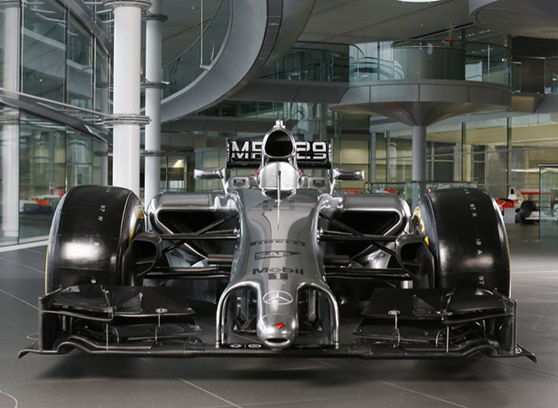
So let’s work our way forward from the bulkhead to the tip of the nosecone instead of backward from the tip of the nose. What teams like Williams and McLaren have done is design a front nosecone section that descends from the bulkhead and gets to the area with the pylons that support the front wing. They want to keep this area as open as possible in order to get airflow under and around the car. However, the wing pylon area wasn’t low enough to meet the nose tip requirement of being 18.5 cm above the reference plane. To fix that, they added a proboscis that extends forward and down to be the “forward-most point.” Furthermore, 5 cm behind the tip of that nose, the area of the nose is 900 cm squared. Voilà, they are now within the regulations.
The variation in the anteater noses – for instance, Red Bull’s “paper-thin” nose compared to Caterham’s bulbous figure – is merely about how designers want to hang the front wing according to the aero needs of the entire car determined by the engineers.
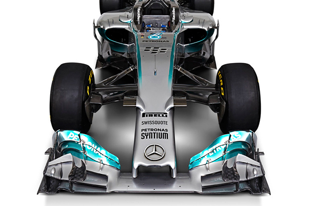
As we’ve seen with the Ferrari and the Mercedes, though, a wholly different solution is possible within the same guidelines. The “DustBuster” front end out of Maranello and the staple opening from Brixworth have run the functional front of the car all the way to the 18.5-cm forward-most point instead of using a finger extension to do so. Five centimeters aft of that, the regulations don’t stipulate any shape for that 900-cm-squared surface area; it can be round like a finger or, as seen on the Ferrari and Mercedes, squared off.
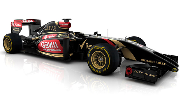
The unsightly sag in the nosecones on both cars exists because the regulations have also lowered the front of the bulkhead, where the nosecone attaches, by 10 cm. Teams didn’t want to have to change their suspension designs, though, so the drop begins slightly forward of the suspension arms. They still want to keep the nosecone surfaces as high as possible within the regulations, so there’s a steep decline forward of the bulkhead face that relents so that the nosecone surface doesn’t drop below the minimum required height. As long as they make the numbers, they’ve satisfied the regulations. Next year, the regulations will outlaw that maneuver, forcing the stretch of bulkhead from its face to the cockpit opening to form one linear angle as seen on the Lotus.
After the safety imperative, every F1 team designer has said their number-one priority in 2014 is – as it was before this year – aerodynamics. And after that, team officials have various takes on the nose situation. Ferrari technical director James Allison, who worked on the twin-pronged Lotus nose, thinks the uproar is “overplayed” because “it isn’t actually that sensitive an area, and there are lots of different solutions that work.” Toro Roso’s chief designer agrees with Allison, but Toro Rosso team boss Franz Tost thinks the new noses are so ugly that they don’t belong in F1, and Caterham boss Cyril Abiteboul agrees with Tost, saying, “I think F1 is still show business and it should still be attractive to people.” Going off the reservation, Red Bull chief designer Adrian Newey thinks the low noses are more unsafe than before, alluding to the possibility of snowplowing under the car in front instead of being launched over it. And rumors are that the FIA is looking at the “spear-like danger” of the new cars.
It’s likely we’ll see different noses by the end of the year compared to now. But as long as one’s favorite car wins, it’s likely people will be willing to forgive how the cars look. At least until the end of the first race in Australia.


